
Full horizontal logo displayed in the web administration header and expanded navigation.
EasyPlex 2.4 · buyer walkthrough
Visual branding guide
Follow these three visual workflows to replace the panel and mobile logos, apply an Android color system, and arrange the mobile home screen. No catalog changes require Android Studio; only compiled Android colors and launcher assets require a new app build.
1Upload the correct logo for each surface
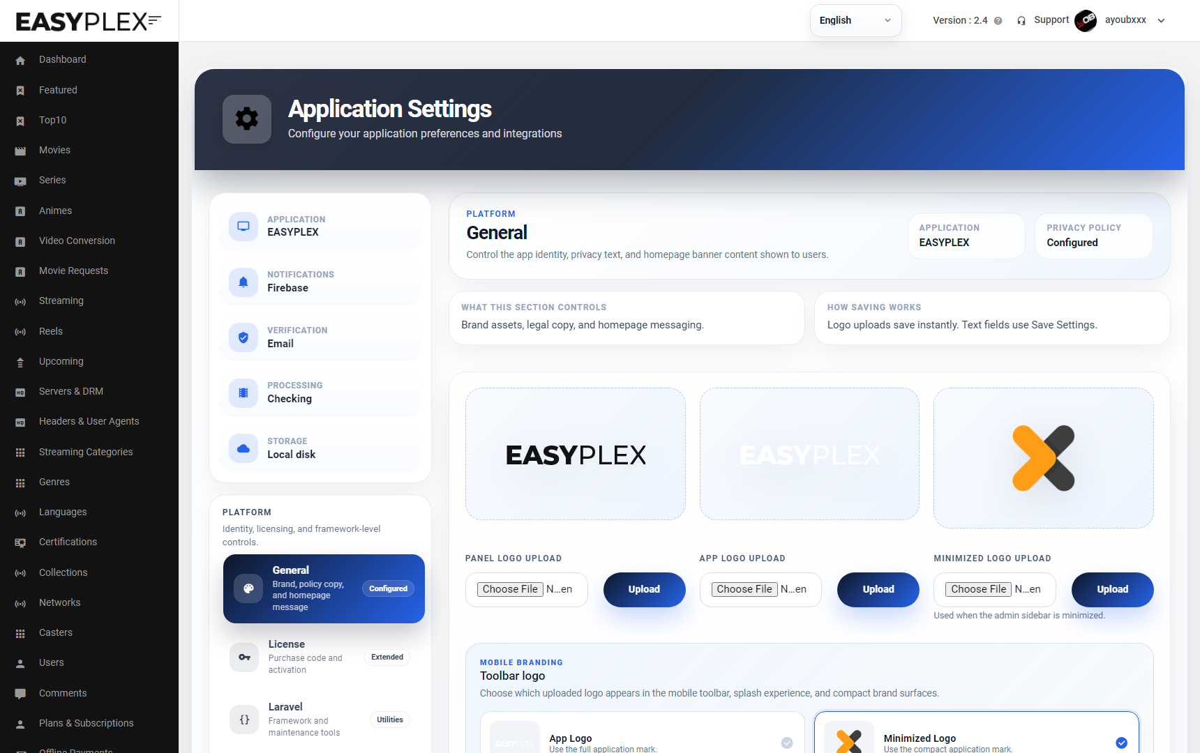
Open Admin → Settings → General. The current EasyPlex 2.4 screen below contains three independent upload controls. Select the file beside the intended preview, then choose its adjacent Upload button. Logo uploads save immediately.
 123
123
Full mobile brand mark available to the toolbar and other wide app surfaces.
Compact square mark for the collapsed admin sidebar and compact mobile locations.
Logo uploads accept SVG, PNG, or JPG. Use transparent SVG/PNG where possible. Preview both light and dark backgrounds before launch.
- Prepare one wide logo and one compact square mark with safe padding around the artwork.
- Upload each file using its own adjacent button; do not select three files and press only one button.
- Under Mobile branding → Toolbar logo, select the full or minimized mark used by the Android toolbar.
- Save text/settings changes, refresh the panel, and fully restart the Android app to verify cached images.
Launcher icon and native splash: the panel does not replace Android launcher/adaptive icons compiled into the APK. Replace those through Android Studio’s Image Asset tool, preserve the foreground safe zone, then rebuild and sign the app.
2Apply a readable Android color system
Edit Android Source/EasyPlex2.4/app/src/main/res/values/colors.xml. The application aliases its main Material colors to the five foundational values shown below. Changing these base values updates the majority of screens consistently.
#0B0B0Bwa_settings_bg#171818wa_settings_card#BDAE8Fwa_settings_green#F4F4F4wa_settings_text_primary#8E8E8Ewa_settings_text_secondary<color name="wa_settings_bg">#0B0B0B</color>
<color name="wa_settings_card">#171818</color>
<color name="wa_settings_card_pressed">#242424</color>
<color name="wa_settings_text_primary">#F4F4F4</color>
<color name="wa_settings_text_secondary">#8E8E8E</color>
<color name="wa_settings_green">#BDAE8F</color>Keep normal text at least 4.5:1 against its background and large text/icons at least 3:1.
Check focused, pressed, disabled, loading, dialog, subtitle, and player-control states—not only the home screen.
Run a clean debug build, then test one release build on a phone and Android TV before distribution.
3Arrange the mobile home screen
Open Admin → Settings → Content Control. Set the Home feed/section limits, drag rows by the handle into the required order, and choose Save Settings. Empty or disabled sections remain hidden automatically.
⠿1
PinnedEditorially pinned movies, series, or anime.
⠿2
Top Content / Top 10Curated top-content list.
⠿3
New ReleasesLatest mixed movie and series content.
⠿4
Watch In Your LanguageLanguage discovery rail.
⠿5
NetworksNetwork discovery rail.
Drag → Save → Refresh. The first non-empty enabled row becomes the first visible rail below the featured area.
↓
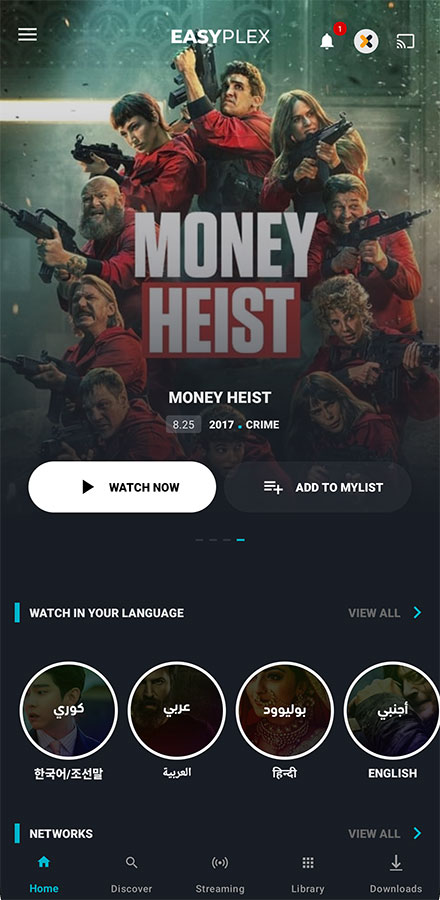
- Place the most important licensed catalog rows first and keep the first screen focused.
- Set reasonable limits; very large rails increase response size, image loading, and memory usage.
- Save Settings, clear the API response cache if enabled, and fully restart the app.
- Test with a signed-out user, normal user, premium user, kids profile, empty catalog, RTL language, phone, and TV.
Final visual approval checklist
Wide and compact logos are sharp, correctly padded, and readable in expanded and collapsed navigation.
Toolbar, launcher icon, splash, buttons, text, dialogs, player controls, and TV focus states use the intended brand.
Rail order matches Content Control, empty rows disappear, artwork is licensed, and loading remains smooth.